Choosing the Kaffe Fassett Shirt Stripe Boxes Pattern
As soon as Eunice contacted me to make her some quilts using her beloved brother’s clothes, we started discussing patterns. She had sent many plaid and checked cotton shirts along with a number of flannel shirts plus some plain cotton ones and a few with patterns. Eunice, herself an accomplished quilter, wanted someone else to make the bereavement quilts. She was a referral from another quilter who had closed her business. We immediately clicked, and I knew it would be great fun to work with her.
I had always wanted to make Kaffe Fassett’s Shirt Stripe Boxes pattern but had not found a customer who wanted it. I was delighted when Eunice right away agreed with me and thought it would be perfect for her brother’s shirts.
Shifting Priorities
When the time came to start on Eunice’s quilt, I realized that I wouldn’t have the weeks it would take for the Boxes pattern. At the same time, I realized there were a large number of flannel shirts which I couldn’t use in the Boxes quilt. I suggested postponing the more time-consuming Boxes quilt, but making three smaller quilts out of the flannel shirts. Eunice agreed.
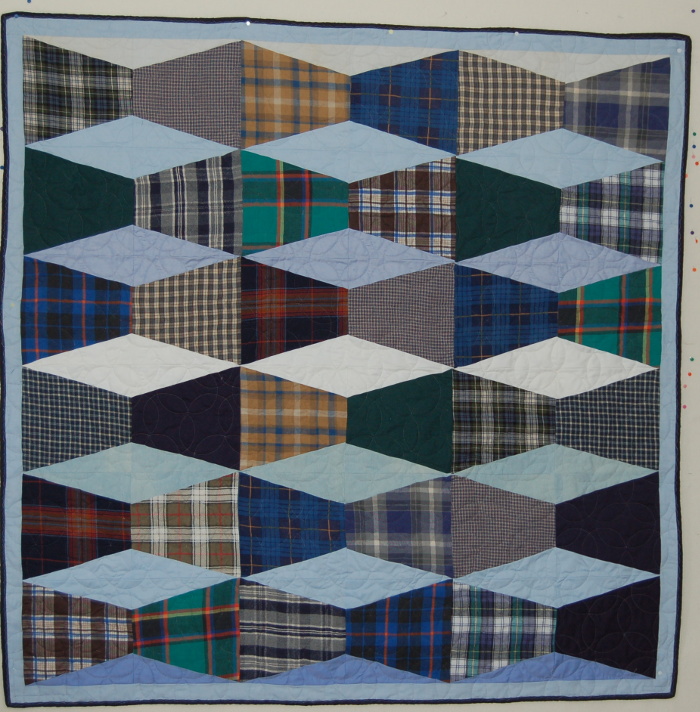
Bereavement Quilt using Invisible Boxes pattern
I had recently made quilts with the Invisible Boxes pattern for another customer and found they were relatively quick and easy to make. Eunice wanted one each for her grown son and daughter and one for herself. The one above is just one of the three I made for her.
Making the Shirt Stripe Boxes Quilt
Preparing the Fabric
Finally the time came to make the shirt stripe boxes quilt. Initially I cut up all the striped or checked (and some plaid) shirts. At this point, Eunice had decided she loved the Boxes pattern so much she wanted one for both her son and daughter as well. Not only did I cut out all the useable parts of each shirt but stabilized them with EK-130 netting as well. In forming the boxes, I didn’t want the cotton to shift, even though cotton isn’t as flexible as knits.
Cutting out the Pieces
I often ignore patterns, but with Kaffe Fassett patterns, time is saved if I follow his excellent instructions to the letter. I cut an equal amount of pieces for three different sized boxes (3-inch, 6-inch, and 9-inch) from each of 27 shirts. Cutting had to be precise, if possible, in order for the box to form accurately. Impishly, Fassett helps the quilter by encouraging them to break the rules. He suggests adding pieces where they ought not to be and occasionally make them “sloppy”. I had no problem doing this, especially with the plaid shirts, which would line up in peculiar but sometimes interesting ways.
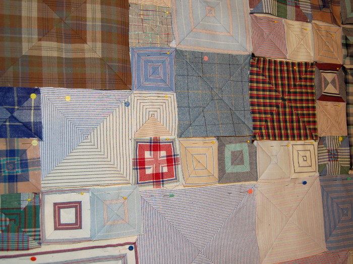
Closeup of boxes formed in initial patchwork of Box pattern
Forming the Boxes
This is where the fun started. It was exciting to watch the boxes form, even though sometimes they had to be discarded as even too sloppy. But those throwaways were but a few.
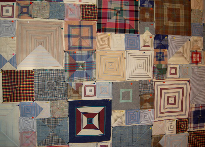
Closeup of boxes on design wall before sewn together to form a patchwork
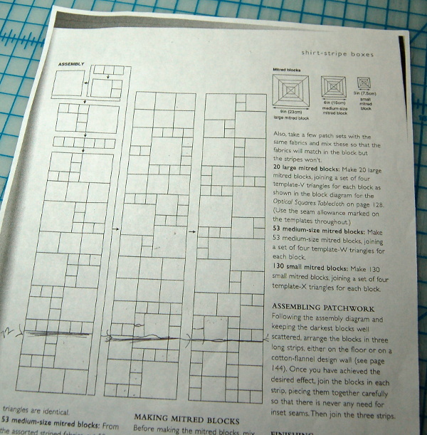
Designing the Quilt using the Kaffe Fassett Cheatsheet
Fassett provides an overall plan for each size but the actual choice within those parameters is up to the quilter. Below is a picture of the cheatsheet which I followed. I wanted to make a different size quilt for my customer, shorter and wider. So I cut it off at a precise point and changed a few of the box sizes to fit my new plan. To widen the quilt, I added the first of the three columns at the end, forming four columns:
Kaffe Fassett cheatsheet for patchwork of Boxes pattern
Below is a picture of a Kaffe Fassett Shirt Stripe Box quilt in its prelimary form, ready to be sewn into a patchwork.
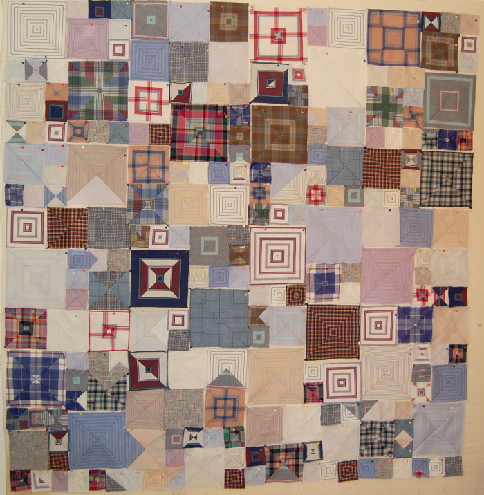
Patchwork of bereavement quilt using Kaffe Fassett’s Shirt Stripe Boxes pattern
Finalizing the Quilt
Fassett suggests quilting in the lines, but he has some patient quilters at his command. Even with a long arm machine, quilting ‘in the ditch’ is time consuming and difficult. I used one of my favorite templates to quilt this patchwork, a spiral template easily seen in the picture below. My customer loved it.
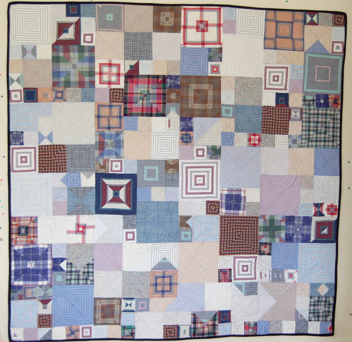
Boxes Bereavement Quilt Made with Brother’s Shirts
Final Touch – A Label
I quilted it with a spiral design using one of my favorite templates. Fassett suggests quilting along the seams, but he has patient quilters at his beck and call. For me that is much too time-consuming and difficult. My final touch is always sewing an embroidered label on the back with words chosen by my customers. This label was quite special.
I had chosen a calming light-colored backing to contrast with all the business of the front. It can be seen as the background of the label.
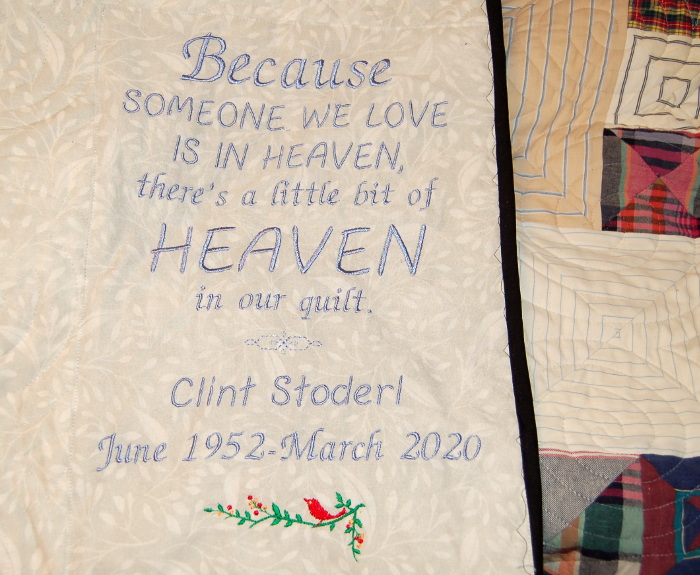
Label for Boxes Bereavement Quilt
The calm pastel backing is a nice contrast to the busyness of the front, shown above in the background of the label.
